Brand Guidelines
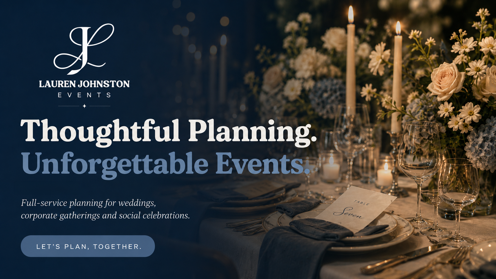
Thoughtful planning. Intentional design. Unforgettable experiences.
The Lauren Johnston Events brand reflects the way we approach every celebration: with purpose, clarity, warmth and an unwavering attention to detail.
These guidelines are designed to keep our visual identity and communication consistent across every touchpoint, from proposals and social media to signage, vendor materials and the events themselves.
Our logo is the most recognizable expression of our visual identity.
Its elegant monogram paired with structured typography reflects the balance at the center of the brand: creativity supported by thoughtful organization.
Always use approved logo files and maintain the original proportions, spacing and typography.
Logo Suite
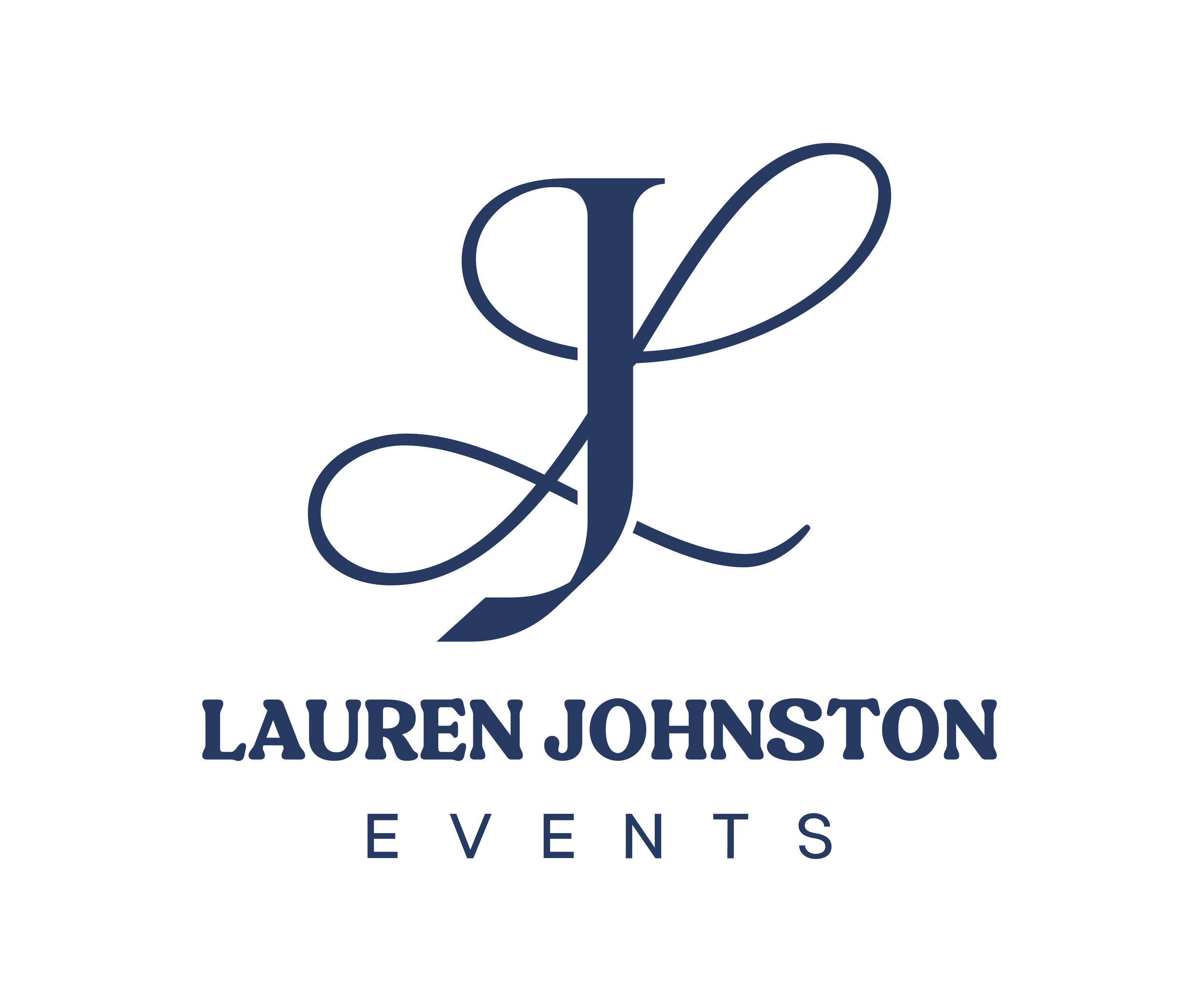
PRIMARY
The primary Lauren Johnston Events logo should be used whenever space allows.
It is our preferred brand signature for the website, proposals, printed materials, vendor communications and other applications where the full company name should be clearly identified.
SUBMARK
The circular submark provides a more decorative expression of the brand.
It works particularly well for social media graphics, packaging, stickers, event details, stationery and other applications where the brand is already established.
SECONDARY
The secondary logo offers a more compact configuration while maintaining full brand recognition.
Use it in vertically oriented layouts or applications where the primary logo does not fit comfortably.
ICON
The LJ monogram is our simplest brand mark.
Use it when space is limited or when Lauren Johnston Events has already been identified elsewhere in the experience.
Ideal applications include favicons, social profile imagery, small-format print pieces.
Using Our Logo
-
Please do not redraw, rearrange or alter the logo elements.
Maintain sufficient clear space around the mark so it can breathe and remain legible within the surrounding design.
-
Use approved logo artwork.
Maintain the original proportions.
Choose the version with the strongest contrast against its background.
Allow generous space around the logo.
Use brand-approved colors whenever possible.
-
Stretch or distort the logo.
Change the typeface.
Rearrange the monogram and wordmark.
Add shadows, outlines or effects.
Place the logo over busy photography without sufficient contrast.
Rotate the logo.
Recolor individual portions of the logo outside the approved color combinations.
Let the brand B R E A T H E
Let the brand B R E A T H E
White space should never be treated as empty space. It gives photography, typography and important information room to stand on their own.
Avoid overcrowding layouts with unnecessary graphics, text or decoration.
When in doubt, simplify.
Our Colors
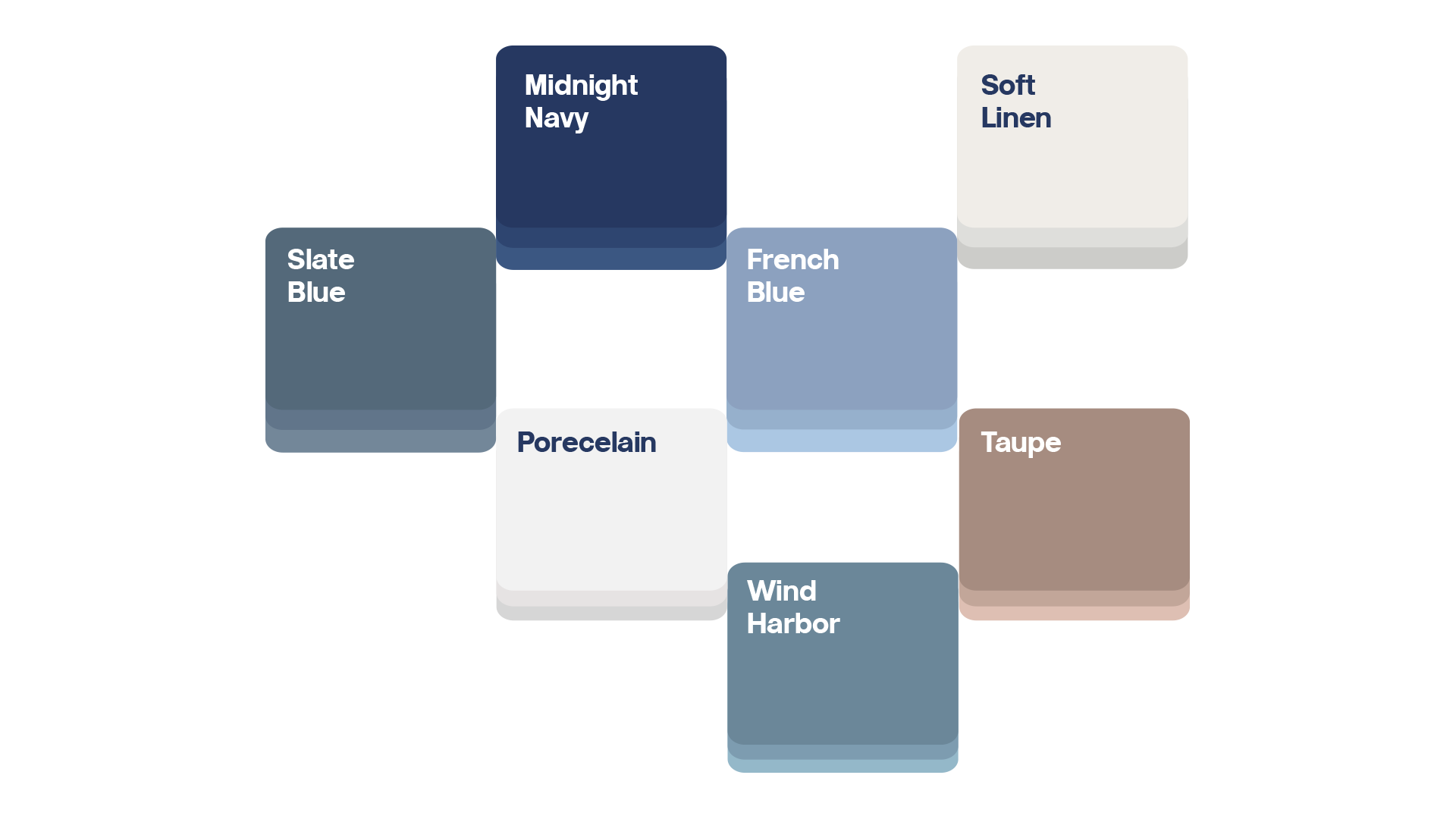
Porcelain : F2F2F2
Soft Linen : EFEDE8
Our palette was created to feel calm, sophisticated and welcoming.
Deep blues establish trust and structure, while softer blues create ease and approachability.
Warm neutrals prevent the identity from feeling overly corporate and introduce the warmth associated with celebrations, hospitality and beautifully considered spaces.
Hex Codes at a Glance
Midnight Navy: 2A375E
Slate Blue: 586878
Wind Harbor: 718697
French Blue : 90A0BC
Taupe : A28D81






Typography
Our serif typography expresses elegance, personality and editorial sophistication.
Our sans-serif typography provides structure, clarity and modernity.
Together they create a brand that feels elevated without becoming formal or inaccessible.


Best used for:
Headlines, hero statements, section titles, pull quotes and short editorial phrases.
Avoid using for:
Long paragraphs, small text or information-heavy layouts.
Bremlin is the primary display typeface for Lauren Johnston Events.
Its graceful, editorial character brings sophistication and personality to the brand while reinforcing the sense of intentionality behind every experience we create.
Use Bremlin for large headlines, meaningful statements, campaign messaging and moments where the brand should feel elevated and memorable.
It works best when given room to breathe.

Best used for:
Subheadings, navigation, buttons, labels, service names, short descriptions and supporting brand language.
Avoid using for:
Dense body copy or applications where a softer editorial tone is more appropriate.
Aloevera Display provides a contemporary counterpoint to the elegance of Bremlin.
Its cleaner structure brings clarity and energy to the identity, helping the brand feel polished without becoming overly formal.
Use Aloevera Display for supporting headlines, navigation, labels and concise messaging where readability and
structure are important.
It should feel confident, simple and intentional.
Bremlin sets the mood. Aloevera Display brings the clarity. Together, they create a visual language that feels thoughtful, polished and distinctly LJ Events.
Iconography


Our illustrations simplify the different areas of our brand experience into a consistent visual language.
Icons should feel delicate, considered and slightly whimsical while remaining sophisticated.
Use icons to support communication—not replace it.
Maintain consistency:
Line weight - Scale - Stroke style - Color - Level of visual detail
Avoid introducing illustration styles that feel cartoonish, overly ornate or inconsistent with the established icon family.Icons should feel delicate, considered and slightly whimsical while remaining sophisticated.
Partner & Vendor Use
Our brand alongside yours
LJ Events frequently collaborates with venues, caterers, florists, photographers and other creative partners.
When our identity appears alongside another brand, both should remain clearly independent and visually balanced.
Do not modify either company's logo in an attempt to make the identities match.
Unless an official partnership has been established, placement should not imply sponsorship, ownership or endorsement.
Social Media
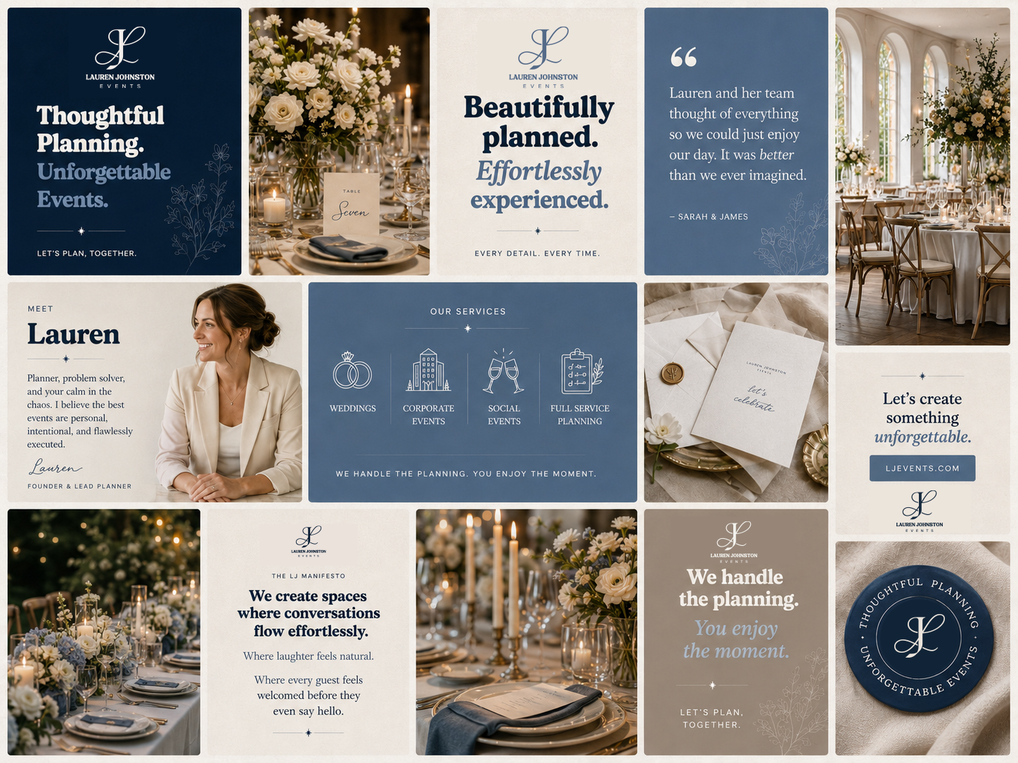
Our social presence feels less like a traditional ad and more like an invitation into the experience.
Finished Experiences — tablescapes, room reveals, florals, installations and memorable event moments.
Behind the Details — planning notes, timelines, setup, vendor collaboration and thoughtful decisions clients may never see.
People & Connection — genuine guest interactions, celebrations, laughter and emotional moments.
Planning Expertise — useful advice presented simply and confidently.
Client Stories — testimonials, event recaps and moments that demonstrate the experience of working with LJ Events.
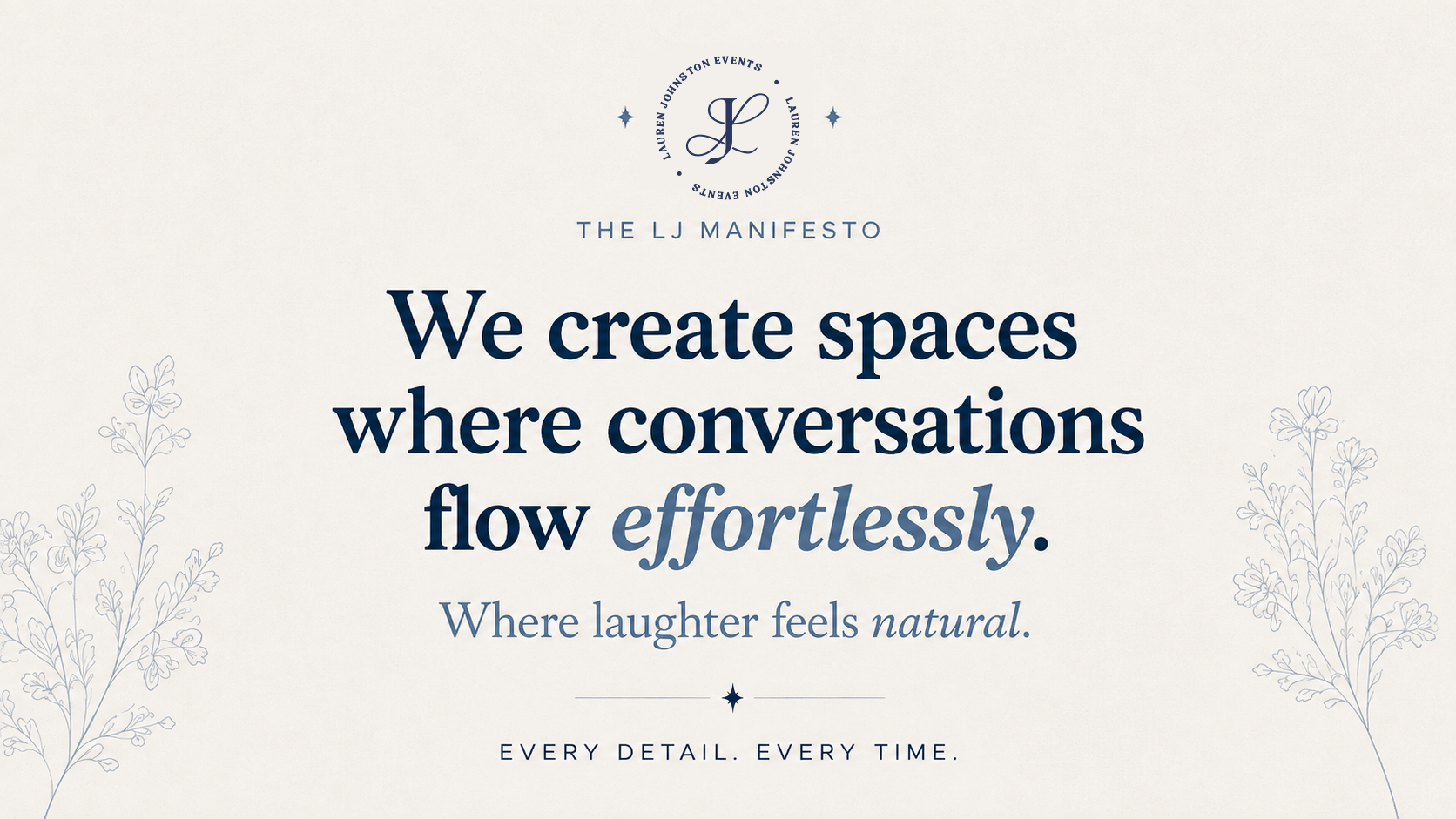
Brand Statements — concise messaging that reinforces what we believe about hospitality, planning and celebration.